Introduction

This project is a rebranding of GuoLiCheng (Minute Maid Pulpy), a fruit beverage known for its real fruit pulp and strong presence in the Chinese market. I worked through analyzing the brand’s current visual identity, messaging, and positioning, and explored how it connects with its target audience. I found it interesting that while the product emphasizes freshness and real ingredients, its existing design does not fully communicate that message. This became the starting point for my redesign. Overall, this project focuses on rethinking how visual identity and branding can better reflect a product’s core idea and create a stronger connection with its audience.
I got this big idea of "every sip feels like home". This idea is rooted in the shared experiences of my generation in China, for whom GuoLiCheng was a familiar part of everyday life. The drink commonly appeared at family dinners, school events, and in moments that once felt ordinary but have since become meaningful in memory. As this generation grows older and transitions into more independent lives—such as attending university or living abroad—revisiting this familiar taste evokes more than simple refreshment; it reconnects individuals with a shared cultural memory. the rebrand aims to reconnect consumers with a sense of comfort and belonging, transforming memory into an emotional connection.
Brand Overview
Rebranding Process
New logo+Packaing Design


Social Videos

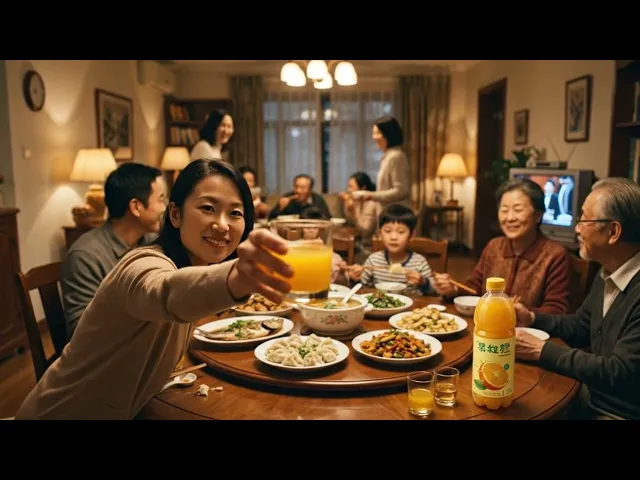
Left Social Video:
This video connects to the core idea of “Every sip feels like home.” As we move into new stages of life, returning home becomes less frequent due to increasing responsibilities. However, the act of drinking GuoLiCheng evokes memories of childhood—family gatherings, shared meals, and the warmth of relationships with parents and friends. The video aims to translate this emotional connection into a visual narrative.
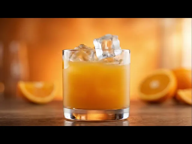
Middle Social Video:
This video focuses on the product itself by illustrating the process behind GuoLiCheng. It highlights how the beverage is made, reinforcing ideas of freshness, authenticity, and real ingredients.
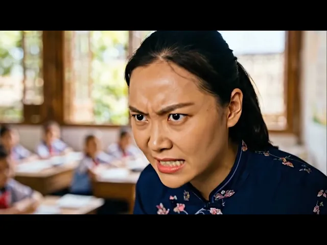
Right Social Video:
This video draws inspiration from a personal childhood memory. It references a moment in elementary school in China, when a teacher was initially frustrated as we weren't listening, became noticeably calmer after drinking a beverage. This scene is reinterpreted in the video to convey how GuoLiCheng can shift mood as"it can help you feel the fruity taste of love".
Summary

Through research, I analyzed the brand’s visual identity, history, and target audience, and conducted a comparison with its competitors to better identify areas for improvement.
Tools Used


The rebranded logo adopts a more playful and energetic tone, better reflecting the identity of an orange-based beverage. By incorporating an orange element into one of the characters, the design becomes more visually engaging and directly communicates the product. The simplified composition also improves clarity and visual hierarchy, making the logo more legible across different applications. This refinement enhances brand recognition while creating a more cohesive and contemporary visual identity.
Through this rebranding project, I developed a stronger understanding of brand strategy and the role of nostalgia in shaping a cohesive visual and storytelling direction. By defining a clear big idea, I learned how to connect emotional narratives—such as childhood memories—with design decisions to create a more meaningful brand experience. I also explored AI tools for video production, expanding both my technical and creative workflow.
A key challenge was developing the big idea itself, translating personal reflections on GuoLiCheng into a concept that could guide the entire rebrand. Creating AI-generated videos was also difficult, as communicating specific visual outcomes through prompts was often inconsistent. Additionally, the logo and advertising concepts required multiple iterations to achieve a cohesive and visually satisfying result.
To address these challenges, I grounded my design decisions in the brand’s identity and positioning, shifting the visual direction toward a more energetic and contemporary feel. For AI video production, I refined my approach through prompt experimentation and iteration. For advertising, I explored multiple concepts—including process-based and more abstract narratives—to strengthen the overall brand story.
If revisited, I would further refine the logo and packaging while improving the quality and control of AI-generated videos. I would also explore positioning the product toward a more premium market. This experience reinforced the importance of iteration, clear communication—especially when working with AI—and maintaining a strong connection between concept and execution.
I used Adobe Illustrator to create my logo, Adobe Photoshop to make the packaging. Adobe Firefly to make the merges and the AI videos, sound tracks, and sound effects. finally using Adobe Express to edit the videos.